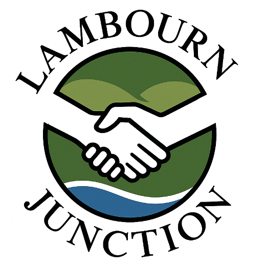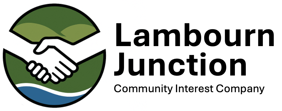
The Lambourn Junction Community Interest Company has proudly revealed a brand-new logo that captures the essence of its mission, location, and values as a not-for-profit, community-based organisation.
The updated design is more than just a visual refresh, it’s a thoughtful representation of what Lambourn Junction stands for. At the heart of the logo are joined hands, a powerful symbol of human connection and cooperation. This image echoes the company’s name – a “junction” – where people, ideas, and support come together, much like a handshake, one of the oldest and most universal gestures of friendship and unity.
Set against the distinctive backdrop of the Berkshire Downs, the logo features the undulating green hills, gleaming white chalk, and the tranquil River Lambourn flowing gently in the foreground. These natural elements reflect not only the landscape that surrounds Lambourn but also the grounded, local nature of the organisation’s work.
“We wanted something that speaks directly to our purpose,” said Christian Noll, “The new logo is a visual metaphor for the work we do bringing people together, offering support, and building community in the heart of the Berkshire Downland.”
From providing a welcoming space for local young people at the Lambourn Youth Junction to supporting those in need through the community food bank and lunch club, the Lambourn Junction has become a vital part of village life.
For more information, visit www.lambournjunction.uk.
